

Split screens
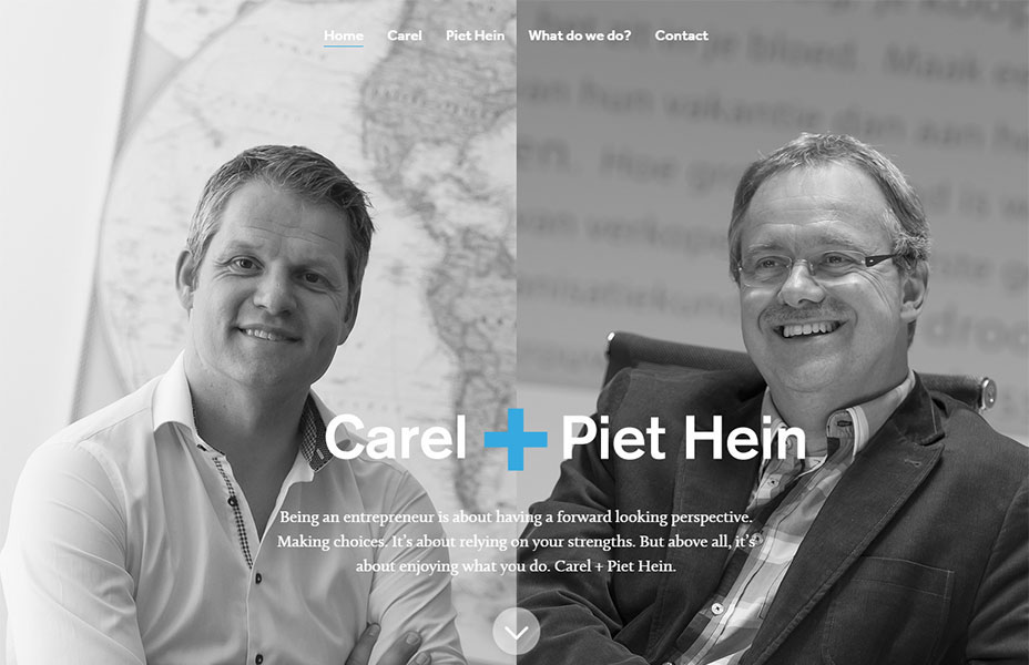
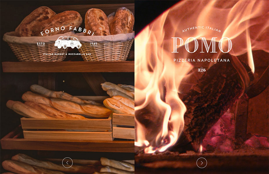
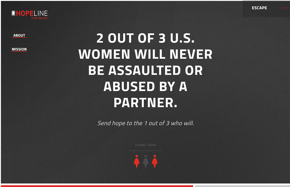
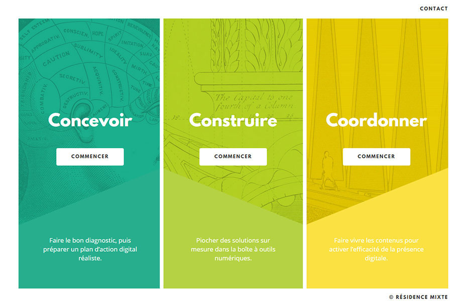
In this category we find a selection of sites that all split the screen using a vertical divide. There are perhaps many reasons to do this, and in surveying many samples of this type I have found two main reasons. The first is that at times a design can really have two primary elements of equal importance. A common approach to web design is to rank things in order of importance. This importance is then reflected in the hierarchy and structure of the design. But what if you actually have two things to promote? This approach allows you to give prominence to them both and allow the user to rapidly select between them. The second reason I have found for this approach is that sometimes you need to convey an important duality. Consider the Eight and Four website for example. Here they want to convey the fact that their core strengths are their digital roots and their talented staff. This pairing is what defines them. The split screen is a lovely way to present this. And I especially love how the ampersand unifies the two sides.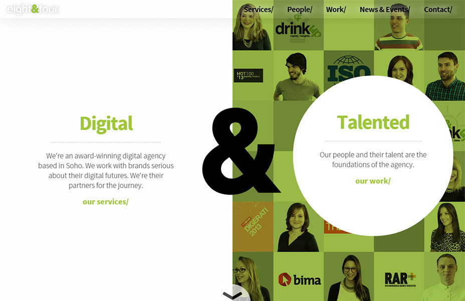
No chrome!
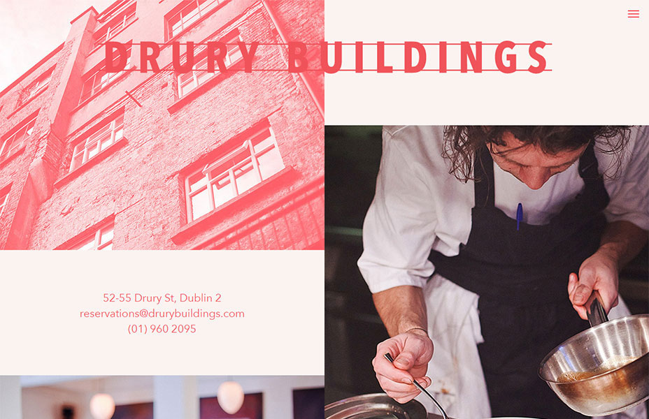
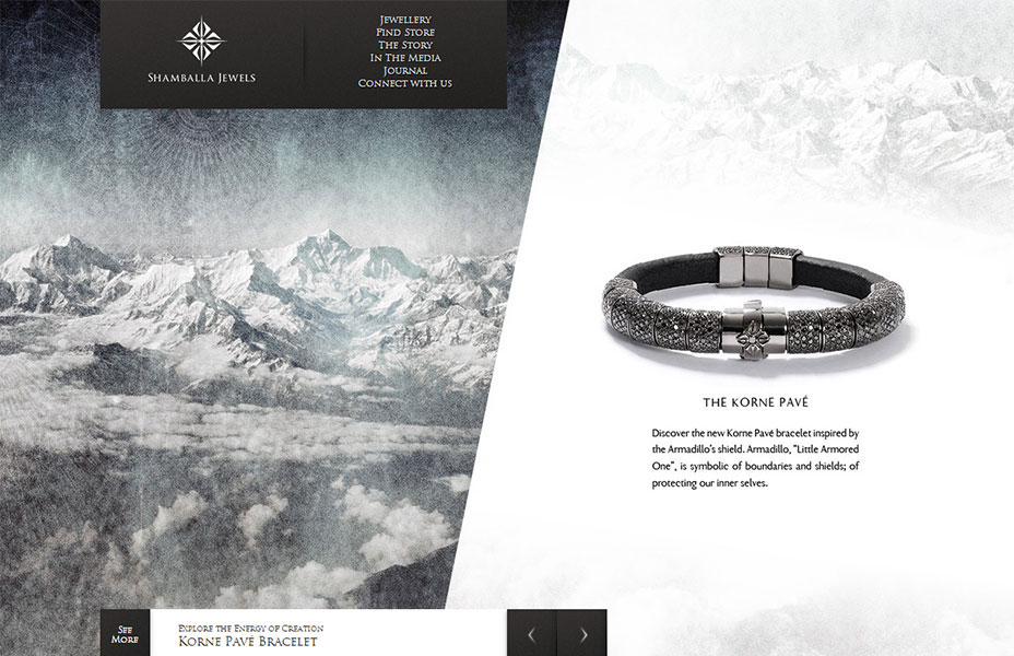
One of the main elements used in web design are containing elements: boxes, borders, shapes and containers of all types used to split the content of a page apart. Consider a stereotypical header where the elements are neatly contained and separated from the content. A common trend now is to remove all of this extra chrome. This is a minimalist approach, but it goes a step further and has some interesting twists along the way.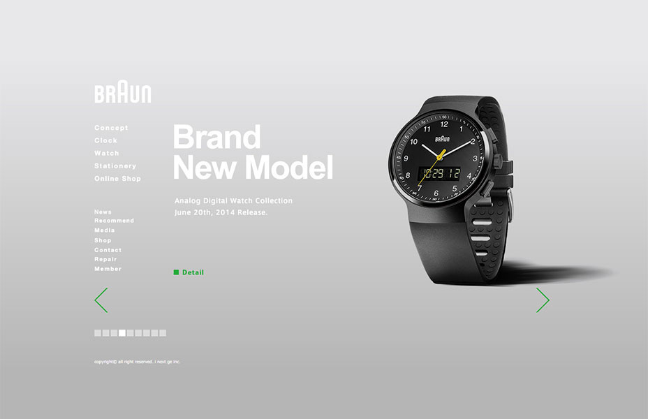 In this example they have eliminated the notion of a header and footer all together. It feels more like an interactive kiosk instead. The hierarchy of content is primarily done through a left to right organization, which helps make the layout very intuitive. And the chrome to separate navigation from content is simply not needed. Instead, the beautiful products shine through.
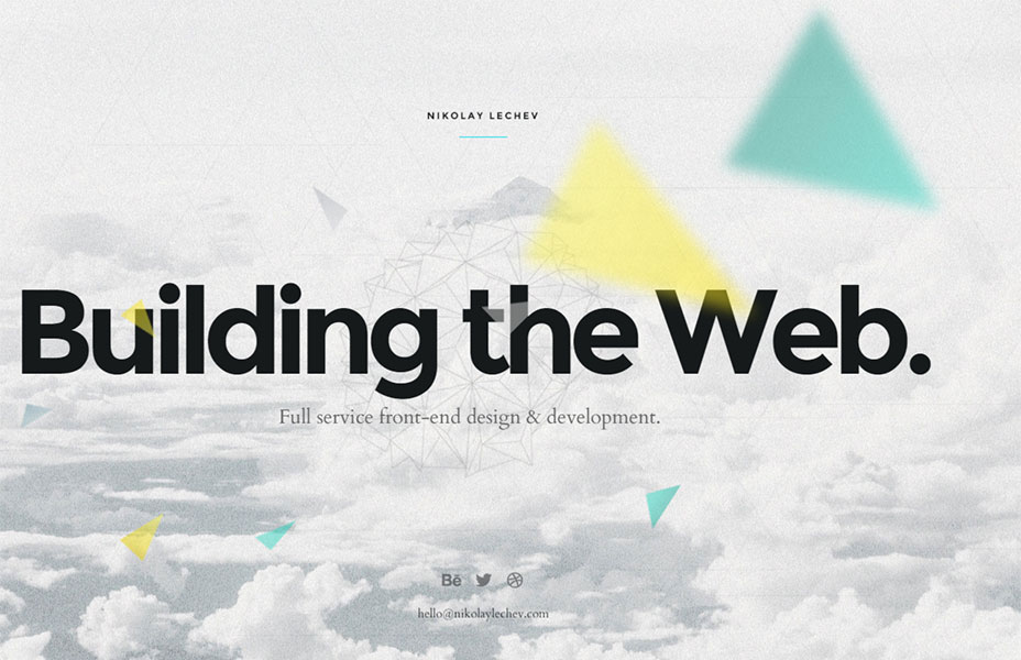
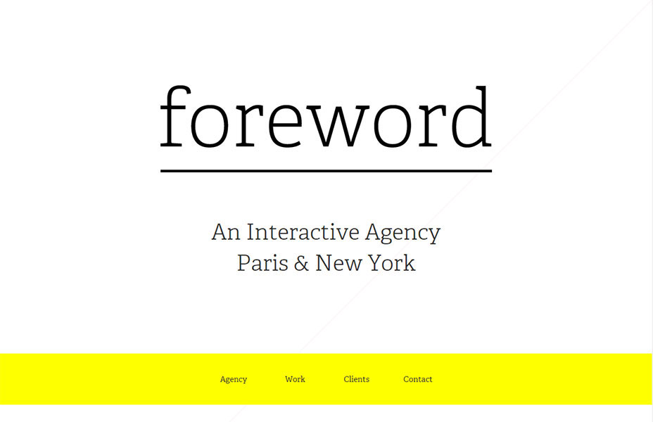 Here we find that the content is greatly emphasized by removing any sense of a header or footer. Instead of reading a header first, you read the name of the company and a clear statement about what they do (and where they do it). Followed by the main navigation. What a great way to emphasize the brand before getting people to navigate. It makes for an elegant flow. Interestingly as you scroll the page gets a header and a touch of chrome. A beautiful and effective layout that uses the pattern in an inspiring way.
Modular or grid based
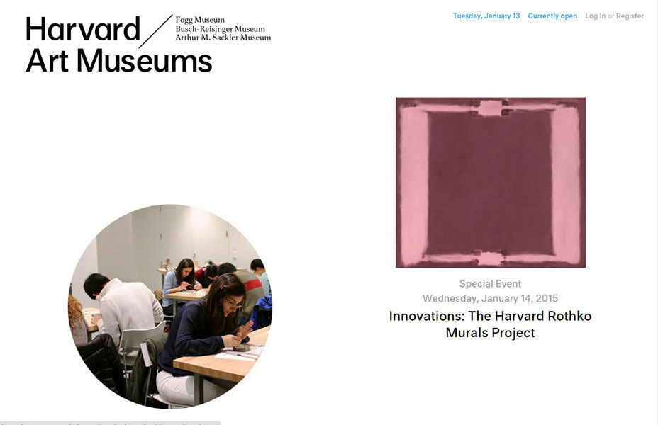
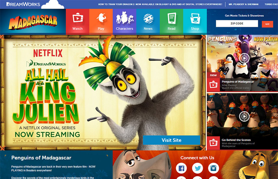
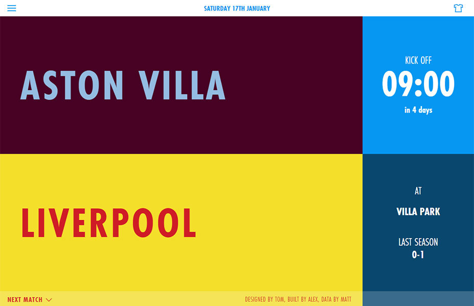
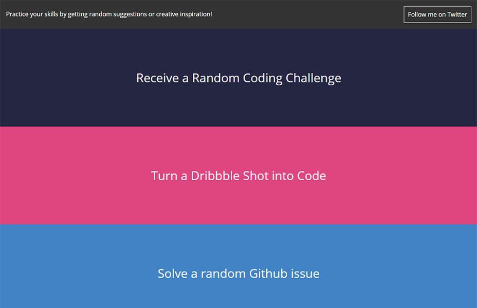
Next up we have layouts built on modular or grid-like structures. In these designs each module is intended to flex based on the screen size. This isn't exactly a new approach, but the introduction of responsive web design has made it even more useful. This hints at the type of adaptable layouts one can create with plugins like Masonry.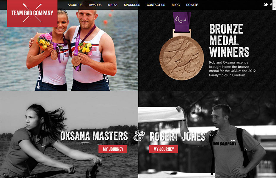 This example perfectly demonstrates the idea. The design is completely responsive. As the screen size changes each module adapts and sizes to fit the space. By dividing the space evenly it is easier to have the design adapt. And they get bonus points for introducing an element (at larger screen sizes) that breaks the rigid barriers between modules.
 This example is a rather intense version of the pattern. It does of course embrace the modular approach, which allows them to easily shift content in and out as needed. But there is an important design element at work here, which the previous example lacked. The size of the modules vary to reflect the order of importance and its place in the hierarchy. A risk of this modular approach is making everything the same size, which means you're not really emphasizing anything. In contrast, this example clearly gives importance to the primary element.
Filling a single screen
Finally we have sites using an approach where the design adapts to completely fill the screen. This is a subset of responsive design in that it adapts to the screen size. But in this niche the designs adapt in such a way such that they completely fill the screen and do not produce scroll bars. This lack of scrolling means the content has to be extremely focused, and the hierarchy of content clearly established. I find the focus and clarity of these sites to be refreshing.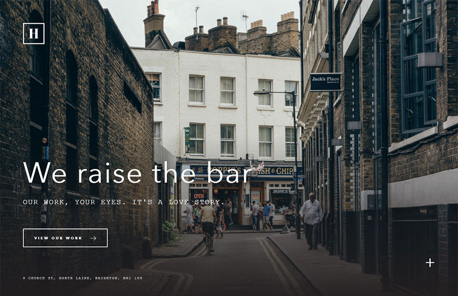

Conclusion
While I have dissected each of these trends here in isolation the reality is that they represent building blocks. And these building blocks can be assembled in many different ways. In fact, many of the samples presented here could be moved around to numerous of the categories we have discussed. The diversity of layouts on the modern web, and the fact that they are usable makes the web an exciting medium to work with.Patrick McNeil
Patrick McNeil is a designer, developer and writer; but above all things he is a passionate educator. He is a Professor of Graphic Design at the University of Missouri St. Louis where he focuses on teaching UX Design methods and front end development techniques. Patrick is also the author of the bestselling book series The Web Designer's Idea Book and the curator of DesignMeltdown.com. For more information about Patrick visit his personal site, pmcneil.com, or follow him on Twitter @designmeltdown.


Read Next

15 Best New Fonts, October 2024
Welcome to our roundup of the best new fonts we’ve found online in the last four weeks. In this month’s selection we…
By Simon Sterne

3 Essential Design Trends, November 2024
Touchable texture, distinct grids, and two-column designs are some of the most trending website design elements of…

20 Best New Websites, October 2024
Something we’re seeing more and more of is the ‘customizable’ site. Most often, this means a button to swap between…

Exciting New Tools for Designers, October 2024
We’ve got goodies for designers, developers, SEO-ers, content managers, and those of you who wear multiple hats. And,…

15 Best New Fonts, September 2024
Welcome to our roundup of the best new fonts we’ve found on the web in the previous four weeks. In this month’s edition…
By Simon Sterne

3 Essential Design Trends, October 2024
This article is brought to you by Constantino, a renowned company offering premium and affordable website design
You…

A Beginner’s Guide to Using BlueSky for Business Success
In today’s fast-paced digital world, businesses are always on the lookout for new ways to connect with their audience.…
By Louise North

The Importance of Title Tags: Tips and Tricks to Optimize for SEO
When it comes to on-page SEO, there’s one element that plays a pivotal role in both search engine rankings and user…
By Simon Sterne

20 Best New Websites, September 2024
We have a mixed bag for you with both minimalist and maximalist designs, and single pagers alongside much bigger, but…

Exciting New Tools for Designers, September 2024
This time around we are aiming to simplify life, with some light and fast analytics, an all-in-one productivity…

3 Essential Design Trends, September 2024
September's web design trends have a fun, fall feeling ... and we love it. See what's trending in website design this…

Crafting Personalized Experiences with AI
Picture this: You open Netflix, and it’s like the platform just knows what you’re in the mood for. Or maybe you’re…
By Simon Sterne